Showing posts with label Bloggers Widgets. Show all posts

Friday, June 26, 2015

How to Install Multi Tab Sidebar Widget in Blogger.

How to Install Multi Tab Sidebar Widget in Blogger.

One benefit of this widget is that you had added too many widgets in the sidebar, then by installing multi tab is going to save the placement of widgets in the sidebar column..It will create your blog becomes more look neat and attractive.


Here is how to add this Widget….

1.Log in to Blogger> Click Template> Edit HTML> Copy the code below just above]]> </ b: skin> or </ style>.

CSS#

/ * Multi Tab Widget * /
.multitab-section {background: # fff; text-transform: uppercase; width: 100%}
.multitab-widget {list-style: none; margin: 0 0 10px; padding: 0}
.multitab-widget li {list-style: none; padding: 0; margin: 0; float: left}
.multitab-widget li a {background: # 22a1c4; color: # fff; display: block; padding: 15px; font-size: 13px; text-decoration: none}
.multitab-tab {border: 0; width: 33.3%; text-align: center}
.multitab-section h2, h3 .multitab-section, .multitab-section h4, h5 .multitab-section, .multitab-section h6 {display: none;}
.multitab-li widget solid # 22a1c4; font-size: 14px; text-transform: capitalize}


2.copy the code below just above the </ body>

jQuery#

<Script type = 'text / javascript'>
// <! [CDATA [
// Multi tab widget
jQuery (document) .ready (function ($) {$ (". multitab-widget-content-widget-id"). hide (); $ ("ul.multitab-widget-content-tabs-id li: first a ") .addClass (" multitab-widget-current "). show (); $ (". multitab-widget-widget-content-id: first '). show (); $ ("ul.multitab-widget-content -tabs-id li a "). click (function () {$ (" ul.multitab-widget-content-tabs-id li a "). removeClass (" multitab-current widget-a "); $ (this) .addClass ("multitab-widget-current"); $ (". multitab-widget-content-widget-id"). hide (); var activeTab = $ (this) .attr ("href"); $ (activeTab ) .fadeIn (); return false;});});
//]]>
</ Script>

3.Then apply the following code just below <div id = 'sidebar-wrapper'>

HTML#

<Div class = 'multitab-section'>
<Ul class = 'multitab multitab-widget-widget-content-tabs-id'>
<Li class = 'multitab-tab'> <a href='#multicolumn-widget-id1'>Latest</a> </ li>
<Li class = 'multitab-tab'> <a href='#multicolumn-widget-id2'>Tags</a> </ li>
<Li class = 'multitab-tab'> <a href='#multicolumn-widget-id3'>Archive</a> </ li>
</ Ul>
<Div class = 'multitab-widget-content multitab-widget-widget-content-id' id = 'multicolumn-widget-ID1'>
<B: section class = 'sidebar' id = 'sidebartab1' preferred = 'yes' />
</ Div>
<Div class = 'multitab-widget-content multitab-widget-widget-content-id' id = 'multicolumn-widget-ID2'>
<B: section class = 'sidebar' id = 'sidebartab2' preferred = 'yes' />
</ Div>
<Div class = 'multitab-widget-content multitab-widget-widget-content-id' id = 'multicolumn-widget-id3'>
<B: section class = 'sidebar' id = 'sidebartab3' preferred = 'yes' />
</ Div>
</ Div>

4.Change the name of the widget title that I put a mark on the code above in accordance with the title of the widget that you want. Last save template and see the results.


How to add Recent Post Widget with Numbered Navigation,to blogger templete.

How to add Recent Post Widget with Navigation,to blogger templete.


By adding recent post widget,visitors can easily see the recent post you made on blog.in this tutorial I will show you how to add a recent post widget to blogger template with navigation.
In this widget users can easily navigate between recent posts of your blog.

Here is step by step procedure how to do this.

1.Go to your blogger dashboard>> Layout>> Click on add Gadgets.


2.Now from there click HTML/JAVA SCRIPT.

3.A small window will appear in Content past the HTML code given below and in Title put a name that you want to show up on widget.


HTML#


<Style scoped = '' type = 'text / css ">
/ * Recent Post Navigation * /
#recentpostnav {border: 1px solid # 585 858; width: 100%; margin: 0 auto}
#recentpostsae {margin: 0}
.recentpostel {background: # fff; display: block; border: 1px solid #ddd; margin: 5px 0; padding: 10px; height: 79px}
.recentpostel img {background: # fff; padding: 4px; float: left; height: 70px; margin-right: 8px; width: 70px; border: 1px solid #ddd}
.recentpostel h6, h6 .recentpostel a {text-decoration: none; font-size: 13px! important; font-weight: 700! important; margin: 0; color: # 111}
.recentpostel: hover {background-color: #fefefe}
.recentpostel p {font-size: 12px; text-align: left; color: # 555; line-height: normal; margin: 5px 0}
0 1px 50% 50% # fff no-repeat; height: 470px; border: 1px solid #ddd}
#recentpostnavfeed {border: 1px solid #ddd; color: #bbb; font-family: Verdana; font-size: 12px; text-align: center; margin: 0}
#recentpostnavfeed: hover {background-color: #fefefe}
#recentpostnavfeed 10px}
#recentpostnavfeed span {padding: 5px 10px}
#recentpostnavfeed .next {float: right}
#recentpostnavfeed .previous {float: left}
#recentpostnavfeed .home {text-align: center}
#recentpostnavfeed a: hover, # recentpostnavfeed span.noactived {color: transparent! important}
</ Style>
<Script type = 'text / javascript'>
// <! [CDATA [
    var numfeed = 5;
    startfeed var = 0;
    var urlblog = "Http://viennatheme.blogspot.com";
    var charac = 40;
    var urlprevious, urlnext;
arlinafeed function (e, t) {for (var n = n.join (""), n = n.substring (0, t-1)} function showrecentpostsae (e) {var t, n, r, a, i, s = ""; urlprevious = "", urlnext = ""; for (var d = 0; d <numfeed && d! = e.feed.entry.length; d ++) {t = e.feed.entry [d], n = t.title. $ t; for (var l = 0; l <t .link.length; l ++) if ("alternate" == t.link [l] .rel) {r = t.link [l] .href; break} i = "content" in t? t.content. $ t: "summary" in t? t.summary. $ t: "" a = "$ thumbnail media" in class = 'recentpostel'> ', s + = "<a href='"+r+"' target='_blank'> <img src ='" + a + '' /> </a> ", s + =" <h6 > <a href = 'javascript: navigasifeed (-1);' class = 'previous'> Previous </a> ":" <span class =' ​​noactived previous'> Previous </ span> ', s + = urlnext? "<a href = 'javascript: navigasifeed (1);' class = 'next'> Next </a> ":" <span class = 'noactived next'> Next </ span> ', s + = "<a href =' javascript: navigasifeed (0); "class =" home "> Home </a>", document.getElementById ("recentpostnavfeed"). innerHTML = s} function navigasifeed (e) {var id = 'recentpostload'> </ div> ", document.getElementById (" recentpostnavfeed "). innerHTML =" "; var removerscript () {var
//]]>
</ Script>
<Div id = "recentpostsae"> </ div>
<Div id = "recentpostnavfeed"> </ div>

4.Arrenge the widget in blogger layout and place the widget where you want to show up Recent post.

After arranging the widget Click on save arrengment.


Thursday, June 25, 2015

How to Add a Demos and Downloads Buttons for Downloading blogs or sites

How to Add a Demos and Downloads Buttons for Downloading blogs or sites


Here is Demo and Download bottons for those blogs which provide download content.
Setting up is pretty easy by following these simple steps.

These buttons will add proffesional look to your blogbesides of using traditional blue link.

These buttons are animated also.


1.Go to your blogger dashboard>> Template>> Edit Template. 
               
        2.Hit Ctrl+F and find </head> and past the following code before </head>

<Link href = '// netdna.bootstrapcdn.com/font-awesome/4.0.3/css/font-awesome.css' rel = "stylesheet" />

3.Now search for </style> and Apply code below before </ style>

CSS#

.whitebutton {
    margin: 20px auto;
    padding: 20px 0;
    width: 200px;
}

.whitebutton a {
    background: # fff;
    color: # 666;
    display: block;
    font-size: 17px;
    font-weight: 700;
    font-family: 'Arial', Verdana, sans-serif;
    height: 50px;
    line-height: 50px;
    text-align: center;
    text-decoration: none;
    text-transform: uppercase;
    width: 200px;
    position: relative;
    z-index: 2;
}

.whitebutton a: before {
    content: '\ f019';
    font-family: FontAwesome;
    font-weight: normal;
    padding: 8px;
    margin-left: -12px;
    margin-right: 6px;
}

.whitebutton span {
    background: # 444;
    color: # fff;
    display: block;
    font-size: 12px;
    font-family: 'Arial', Verdana, sans-serif;
    height: 40px;
    line-height: 40px;
    text-align: center;
    width: 200px;
    z-index: 1;
    text-transform: uppercase;
    font-weight: bold;
}

.whitebutton .up {
    background: # e25734;
    margin: auto -25px;
    opacity: 0;
    border-radius: 5px 0 0 5px;
    transform: translate (0, -50px);
    transition: 350ms;
}

.whitebutton .down {
    margin: auto -30px;
    opacity: 0;
    border-radius: 5px 5px 0 0;
    transform: translate (0, -50px);
    transition: 350ms;
}

.whitebutton .down: before {
    content: '\ F14A';
    font-family: FontAwesome;
    font-weight: normal;
    margin-right: 6px;
    color: #aaa;
}

.whitebutton: hover {.up
    opacity: 1;
    transform: translate (0,0);
}

.whitebutton: hover {.down
    opacity: 1;
    transform: translate (0, -90px);
}

.whitebuttondemo {
    margin: 20px auto;
    padding: 20px 0;
    width: 200px;
}

.whitebuttondemo a {
    background: # e25734;
    color: # fff;
    display: block;
    font-size: 17px;
    font-weight: 700;
    font-family: 'Arial', Verdana, sans-serif;
    height: 50px;
    line-height: 50px;
    text-align: center;
    text-decoration: none;
    text-transform: uppercase;
    width: 200px;
    position: relative;
    z-index: 2;
    transition: 350ms;
}

.whitebuttondemo a: before {
    content: '\ F002';
    font-family: FontAwesome;
    font-weight: normal;
    padding: 8px;
    margin-left: -12px;
    margin-right: 6px;
}

.whitebuttondemo a: hover {
    color: # fff;
}

.whitebuttondemo span {
    background: # 444;
    color: # fff;
    display: block;
    font-size: 12px;
    font-family: 'Arial', Verdana, sans-serif;
    height: 40px;
    line-height: 40px;
    text-align: center;
    width: 200px;
    z-index: 1;
    text-transform: uppercase;
    font-weight: bold;
}

.whitebuttondemo .up {
    background: # 444;
    margin: auto -25px;
    opacity: 0;
    border-radius: 5px 0 0 5px;
    transform: translate (0, -50px);
    transition: 350ms;
}

.whitebuttondemo: hover {.up
    opacity: 1;
    transform: translate (0,0);
}

1. For those who use Use Reviews Apply the following HTML tags in posts on the HTML tab (not compose)

HTML#1

<Div class = "whitebuttondemo">
<a href="#" target="_blank"> Demo </a> Reviews
<Span class = "up"> click to view </ span> </ div>
Reviews
<Div class = "whitebutton">
<a href="#" target="_blank"> Download </a> Reviews
<Span class = "up"> click to begin </ span> Reviews
<Span class = "down"> 1.6MB .rar </ span> </ div>

     2. For those who use the Press "Enter" to line baruTerapkan following HTML in posts on the             HTML tab (not compose)

      HTML#2

<Div class = "whitebuttondemo">
      <a href=" # "> Demo </a>
      <Span class = "up"> click to begin </ span>
    </ Div>

<Div class = "whitebutton">
      <a href=" # "> Download </a>
      <Span class = "up"> click to begin </ span>
      <Span class = "down"> 1.6MB .rar </ span>
    </ Div>

To use these button,when you make a post and want to show up button at specific place then
copy past the HTML#1 or HTML#2 Code in Html tab of blogger post.

Please replace # in HTML code with your download link..


Automatic Timed & Self-Closing JQUERY Facebook Popup Like Box For Blogger

Automatic Timed & Self-Closing JQUERY Facebook Popup Like Box For Blogger


Often the goal for a website is to generate sales, increase subscription rates, and develop loyal readership. Internet marketers are more familiar to this principle than any others are working online, and part of their success formula is the use of forceful and effective call to action, which is oftentimes contained in a pop-up box or lightbox.  Creating your own pop-ups for your website is not an easy task. You need to have knowledge of programming to be able to generate the codes that define your intended pop-up.

The plugin depends on jQuery, so be sure to include the library. Any recent jQuery version will do. We include plug-in file very similar to jQuery library file in the <head> of the document.

1. Go to your blogger dashboard>> Template>> Edit Template

2.hit Ctrl+F and find </head> and past the following jquery code before </head>.


<script type="text/javascript" src="http://ajax.googleapis.com/ajax/libs/jquery/1.8.2/jquery.js"></script>

3. again find the following code in your template.

]]></b:skin>

4. and paste the below code before/above ]]></b:skin>..

/*css for fbpopup*/
#fbpopupdata { 
    background-color: none; 
    position:absolute; 
    z-index: 9999; 
    display: none; 
    padding: 0; 
    border: 10px solid #446c95; 
    -webkit-background-clip: padding-box; 
/* for Safari */ 
    background-clip: padding-box; 
/* for IE9+, Firefox 4+, Opera, Chrome */ 
    -webkit-border-radius: 8px 8px 8px 8px; 
    -moz-border-radius: 8px 8px 8px 8px; 
    border-radius: 8px 8px 8px 8px; 
    width: 420px; 
    height: 300; 
    overflow: auto; 
    left:50% !important; 
    margin-left:-220px; 
    margin-top:auto; 
    box-shadow: inset 0 1px rgba(0,0,0,0.1); 
}
#fbpopupdata span { 
    font-size: 12px !important; 
    font-weight: normal !important; 
}
#fbpopupdata h1 { 
    background: #446c95 url(https://blogger.googleusercontent.com/img/b/R29vZ2xl/AVvXsEhNvq16cvExAtzJfA6xxVt6aDUDhzMVNlRPBv5jUdFvMGPtpaVunwj_3SD0RWYDt2vyJlA_p5NOQR4n2zVCGn_ezBwWOLXWo_H7hJZbdH1NRFnm0ZjyHhxwXARN4gXu5eIBkf09Uw1RqjQ/s1600/aktechz-fb-lock.png) 98% 30% no-repeat; 
    border: 0px solid #3b5998 !important; 
    color: #FFF !important; 
    font-size: 20px !important; 
    font-weight: 700 !important; 
    padding: 5px !important; 
    margin: 0 0 10px 0  !important; 
    font-family: arial !important; 
    overflow: hidden !important; 
}
.fbpopupdatadata { 
    font-size: 12px !important; 
    font-weight: normal !important; 
    height: 275px !important; 
    padding: 1px !important; 
    background: #fff !important; 
    border-bottom: 0px solid #ddd; 
    overflow: show !important; 
}
#fbpopupdatafooter { 
    text-align: right; 
    font-size:12px; 
    background: #F2F2F2 !important; 
    height: auto !important; 
    padding: 10px !important; 
    overflow: hidden !important; 
}
#fbpopupdatafooter p { 
    text-align: right; 
    font-size:12px; 
}
#fbpopupdataclose { 
    float: right; 
    background-color: #446c95 !important; 
    border: 0px solid #ccc !important; 
    color: #fff !important; 
    font-weight: normal !important; 
    padding: 5px 35px !important; 
    text-decoration: none !important; 
    display: inline-block !important; 
    font-family: arial !important; 
    outline: none !important; 
    font-size: 12px !important; 
    margin: 0px !important; 
    box-shadow: inset 0 1px rgba(0,0,0,0.1); 
    -webkit-transition: background 0.3s; 
    -moz-transition: background 0.3s; 
    transition: background 0.3s; 
}

5. and last and final step,find the </body> by pressing ctrl+f and just paste the below code, before </body> tag.

<!-- Facebook POPUP LikeBox With Timer Code Start --> 
<script type='text/javascript'> 
jQuery(document).ready(function() { 
function fbpopupdatafunc()  { 
var sec = 60 
var timer = setInterval(function() { 
$("#fbpopupdatafooter span").text(sec--); 
if (sec == 0) { 
$("#fbpopupdata").fadeOut("slow"); 
clearInterval(timer); 
} 
},1000); 
var fbpopupdatawindow = jQuery(window).height(); 
var fbpopupdatadiv = jQuery("#fbpopupdata").height(); 
var fbpopupdatatop = jQuery(window).scrollTop()+50; 
jQuery("#fbpopupdata").css({"top":fbpopupdatatop});} 
jQuery(window).fadeIn(fbpopupdatafunc).resize(fbpopupdatafunc) 
//alert(jQuery.cookie('sreqshown')); 
//var fbpopupdataww = jQuery(window).width(); 
//var fbpopupdatawww = jQuery("#fbpopupdata").width(); 
//var fbpopupdataleft = (fbpopupdataww-fbpopupdatawww)/2; 
var fbpopupdataleft = 500; 
//var fbpopupdatawindow = jQuery(window).height(); 
//var fbpopupdatadiv = jQuery("#fbpopupdata").height(); 
//var fbpopupdatatop = (jQuery(window).scrollTop()+fbpopupdatawindow-fbpopupdatadiv) / 2;
jQuery("#fbpopupdata").animate({opacity: "1", left: "0" , left:  fbpopupdataleft}, 0).show(); 
jQuery("#fbpopupdataclose").click(function() { 
jQuery("#fbpopupdata").animate({opacity: "0", left: "-5000000"}, 1000).show();});});
</script> 
<div id="fbpopupdata"> 
<h1>Join Us On Facebook <a style="font-size:12px; color: white; float:right; margin-right: 15px; text-align: inherit; text-decoration: none;" href="http://androidgeekhub.blogspot.com" rel="nofollow" 
>Get Widget</a></h1> 
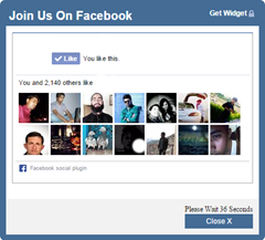
<div class="fbpopupdatadata"><center><iframe src="http://facebook.com/plugins/likebox.php?href=https%3A%2F%2Fwww.facebook.com%2F/androidgeekhub&amp;width=400&amp;colorscheme=light&amp;show_faces=true&amp;border_color=%23fff&amp;stream=false&amp;header=false&amp;height=250" scrolling="no" frameborder="0" style="border:none; overflow:show; width:400px; height:250px;" allowtransparency="true"></iframe></center></div><div id="fbpopupdatafooter">Please Wait <span>60</span> Seconds<br/><a href="wwww.myblogger-tricks.com" target="_blank" id="fbpopupdataclose" onclick="return false;">Close X</a></div></div> 
<!-- Facebook POPUP LikeBox With Timer Code End –>

Okay we've done it

Please change highlighted text with your own  Blogger and FB urls.

Also see:- Here is Another type of facebook popup box.


Wednesday, May 6, 2015

How to creat a Browser for your Blog..

How to creat a Browser for your Blog..


Some time we find that the post on our blog is too much to handle..and finding them page by is such a pain..Its also beneficial for our blog visitors that they can find any post easily without messing up with the contents just like we add a search bar in blog we can add a browser for browse the post related to specific topic...

Here is how to do this,step by step

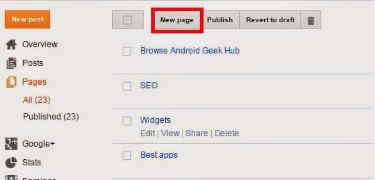
1.Go to the Pages and create a new page.


2.Then Slect New page.


   3.In new page select HTML and select the text inside the page and Delete them. Remeber that after deleting the text dnt go to Compose...


4. Now copy and paste code given blewo in HTML tab..

<div id="table-outer">
<table><tbody>
<tr><td><label>Sort posts by : </label></td><td><select id="orderFeedBy"><option selected="" value="published">New post</option><option value="updated">Post updated</option></select></td></tr>
<tr><td><label>Filter posts by category : </label></td><td><span id="labelSorter"><select disabled=""><option selected="">Loading...</option></select></span></td></tr>
<tr><td><label>Search by keyword : </label></td><td><form id="postSearcher">
<input type="text" /></form>
</td></tr>
</tbody></table>
</div>
<header id="resultDesc"></header>
<ul id="feedContainer"></ul>
<div id="feedNav">
Loading...</div>
<script src="https://arlina-design.googlecode.com/svn/tocs.js" type="text/javascript"></script>
<style scoped="" type="text/css">
#comments {display:none;}
</style>

5.Now Give a Title to the page....anything you wish and publish the page..

6.Now go to layout


 7.Select widgets and add pages...


8.Select the page that we have created earlier and save it...


9.All Done....!!


Note that the Category In the Browser is determined by the tages that you have on your blog..
The tags on blog are shown in Category


Monday, May 4, 2015

How to add Multi Responsive Dropdown Menu in Blogger

How to add Multi Responsive Dropdown Menu in Blogger


In building a menu elements of the first steps we need is HTML

<nav>
<a id="resp-menu" class="responsive-menu" href="#"><i class="fa fa-reorder"></i> Menu</a>   
   <ul class="menu">
   <li><a class="homer" href="#"><i class="fa fa-home"></i> HOME</a>
   <ul class="sub-menu">
   <li><a href="#">Sub-Menu 1</a></li>
   <li><a href="#">Sub-Menu 2</a></li>
   <li><a href="#">Sub-Menu 3</a></li>
   <li><a href="#">Sub-Menu 4</a></li>
   <li><a href="#">Sub-Menu 5</a></li>  
   </ul>
   </li>
  <li><a  href="#"><i class="fa fa-user"></i> ABOUT</a></li>
  <li><a  href="#"><i class="fa fa-camera"></i> PORTFOLIO</a>
  <ul class="sub-menu">
   <li><a href="#">Sub-Menu 1</a></li>
   <li><a href="#">Sub-Menu 2</a>
    <ul>
    <li><a href="#">Sub Sub-Menu 1</a></li>
    <li><a href="#">Sub Sub-Menu 2</a></li>
 <li><a href="#">Sub Sub-Menu 3</a></li>
    <li><a href="#">Sub Sub-Menu 4</a></li>
 <li><a href="#">Sub Sub-Menu 5</a></li>
    </ul>
   </li>
     <li><a href="#">Sub-Menu 3</a>
    <ul>
    <li><a href="#">Sub Sub-Menu 1</a></li>
    <li><a href="#">Sub Sub-Menu 2</a></li>
 <li><a href="#">Sub Sub-Menu 3</a></li>
    <li><a href="#">Sub Sub-Menu 4</a></li>
 <li><a href="#">Sub Sub-Menu 5</a></li>
    </ul>
   </li>
   </ul>
  </li>
  <li><a  href="#"><i class="fa fa-bullhorn"></i> BLOG</a></li>
    <li><a  href="#"><i class="fa fa-tags"></i> CATEGORIES</a>
  <ul class="sub-menu">
   <li><a href="#">Sub-Menu 1</a></li>
   <li><a href="#">Sub-Menu 2</a>
    <ul>
    <li><a href="#">Sub Sub-Menu 1</a></li>
    <li><a href="#">Sub Sub-Menu 2</a></li>
 <li><a href="#">Sub Sub-Menu 3</a></li>
    <li><a href="#">Sub Sub-Menu 4</a></li>
 <li><a href="#">Sub Sub-Menu 5</a></li>
    </ul>
   </li>
     <li><a href="#">Sub-Menu 3</a>
    <ul>
    <li><a href="#">Sub Sub-Menu 1</a></li>
    <li><a href="#">Sub Sub-Menu 2</a></li>
 <li><a href="#">Sub Sub-Menu 3</a></li>
    <li><a href="#">Sub Sub-Menu 4</a></li>
 <li><a href="#">Sub Sub-Menu 5</a></li>
    </ul>
   </li>
   </ul>
  </li>
  <li><a  href="#"><i class="fa fa-envelope"></i> CONTACT</a></li>
  <li><a  href="#"><i class="fa fa-sitemap"></i> SITEMAP</a></li>
  <li><a  href="#"><i class="fa fa-exclamation-triangle"></i> DISCLAIMER</a></li>
  </ul>
  </nav>

The menu at the top is still a pure HTML and if you want to create a menu that works well and looks to be more attractive then the next step we need is the addition of CSS and jQuery function. Here's the code CSS and jQuery .

CSS

not {
    display: block;
    margin-top: 100px;
    background: #374147;
}

.menu {
    display: block;
}

.menu li {
    display: inline-block;
    position: relative;
    z-index: 100;
}

.menu li:first-child {
    margin-left: 0;
}

.menu li a {
    font-weight: 600;
    text-decoration: none;
    padding: 20px 15px;
    display: block;
    color: #fff;
    transition: all 0.2s ease-in-out 0s;
}

.menu li a:hover,.menu li:hover>a {
    color: #fff;
    background: #9ca3da;
}

.menu ul {
    visibility: hidden;
    opacity: 0;
    margin: 0;
    padding: 0;
    width: 150px;
    position: absolute;
    left: 0px;
    background: #fff;
    z-index: 99;
    transform: translate(0,20px);
    transition: all 0.2s ease-out;
}

.menu ul:after {
    bottom: 100%;
    left: 20%;
    border: solid transparent;
    content: " ";
    height: 0;
    width: 0;
    position: absolute;
    pointer-events: none;
    border-color: rgba(255, 255, 255, 0);
    border-bottom-color: #fff;
    border-width: 6px;
    margin-left: -6px;
}

.menu ul li {
    display: block;
    float: none;
    background: none;
    margin: 0;
    padding: 0;
}

.menu ul li a {
    font-size: 12px;
    font-weight: normal;
    display: block;
    color: #797979;
    background: #fff;
}

.menu ul li a:hover,.menu ul li:hover>a {
    background: #9ca3da;
    color: #fff;
}

.menu li:hover>ul {
    visibility: visible;
    opacity: 1;
    transform: translate(0,0);
}

.menu ul ul {
    left: 149px;
    top: 0px;
    visibility: hidden;
    opacity: 0;
    transform: translate(20px,20px);
    transition: all 0.2s ease-out;
}

.menu ul ul:after {
    left: -6px;
    top: 10%;
    border: solid transparent;
    content: " ";
    height: 0;
    width: 0;
    position: absolute;
    pointer-events: none;
    border-color: rgba(255, 255, 255, 0);
    border-right-color: #fff;
    border-width: 6px;
    margin-top: -6px;
}

.menu li>ul ul:hover {
    visibility: visible;
    opacity: 1;
    transform: translate(0,0);
}

.responsive-menu {
    display: none;
    width: 100%;
    padding: 20px 15px;
    background: #374147;
    color: #fff;
    text-transform: uppercase;
    font-weight: 600;
}

.responsive-menu:hover {
    background: #374147;
    color: #fff;
    text-decoration: none;
}

a.homer {
    background: #9ca3da;
}

@media (min-width: 768px) and (max-width: 979px) {
    .mainWrap {
        width: 768px;
    }

    .menu ul {
        top: 37px;
    }

    .menu li a {
        font-size: 12px;
    }

    a.homer {
        background: #374147;
    }
}

@media (max-width: 767px) {
    .mainWrap {
        width: auto;
        padding: 50px 20px;
    }

    .menu {
        display: none;
    }

    .responsive-menu {
        display: block;
        margin-top: 100px;
    }

    not {
        margin: 0;
        background: none;
    }

    .menu li {
        display: block;
        margin: 0;
    }

    .menu li a {
        background: #fff;
        color: #797979;
    }

    .menu li a:hover,.menu li:hover>a {
        background: #9ca3da;
        color: #fff;
    }

    .menu ul {
        visibility: hidden;
        opacity: 0;
        top: 0;
        left: 0;
        width: 100%;
        transform: initial;
    }

    .menu li:hover>ul {
        visibility: visible;
        opacity: 1;
        position: relative;
        transform: initial;
    }

    .menu ul ul {
        left: 0;
        transform: initial;
    }

    .menu li>ul ul:hover {
        transform: initial;
    }
}

@media (max-width: 480px) {
}

@media (max-width: 320px) {
}

jQuery

$(document).ready(function(){
 var touch  = $('#resp-menu');
 var menu  = $('.menu');

 $(touch).on('click', function(e) {
  e.preventDefault ();
  menu.slideToggle();
 });

 $(window).resize(function(){
  var w = $(window).width();
  if(w > 767 && menu.is(':hidden')) {
   menu.removeAttr('style');
  }
 });


});


How to Add Spoiler or HideShow Button in Blogger

How to Add Spoiler or HideShow Button in Blogger


First, go to blogger> Templates> Edit HTML> Apply CSS code below before </ style> or ]]> </ b: skin> and to apply jQuery code before the </ body>

CSS

#flippy { text-align: center; } #flippy button { background: #aa65c7; color: #fff; text-align: center; margin: 0 auto; border: none; border-radius: 3px; padding: 8px 16px; margin: 10px auto; font-size: 14px; font-weight: bold; box-shadow: 0px 3px 0px 0px #883da7; vertical-align: middle; cursor: pointer; text-shadow: 0 1px rgba(0, 0, 0, 0.3); transition: background 0.1s ease-in-out; } #flippy button:hover, #flippy button:focus { background: #9e4fbf; outline: none; } #flippanel { padding: 1px; text-align: left; background: #f5f5f5; border: 0px; } #flippanel { padding: 24px; display: none; }

jQuery

<script> $(document).ready(function() { $("#flippy").click(function() { $("#flippanel").slideToggle("normal"); }); }); </script>


Monday, April 27, 2015

How to change width of Posts, Body and Sidebar in Blogger


How to change width of Posts, Body and Sidebar in Blogger


Normally you can easily do that by using the default template editor that Blogger provides you, but in most cases it does not support custom templates so you would need to manually change the HTML code yourself.

Advantages:
You can place wider widgets on your sidebar - very useful especially for ads
You can have larger images in your posts
Gives your blog a better look

Changing the width:
Now before you begin doing any changes to your template, it is highly advisable that you first create a backup just in case you are not happy with the final results or have accidentally changed the wrong code.
On your right sidebar in the Blogger Administration panel, head into Template, then on the top right side you should see a button Backup/Restore. Click on that and then click on the orange button that says Download full template.
Now that you have made a backup of your template, you can begin experimenting with the width. Below you will find the three different codes being used for all three parts of your template. When you have opened up the HTML editor for your template, simply search for each of these codes.

Overall blog width:
#outer-wrapper {

Sidebar width:
#sidebar-wrapper {

Posts width:
#main-wrapper {

Below each of these codes, you should find another code that says the following:
width: 500px;
In this case, the 500px is just an example. Yours could be 560px, 400px, etc. Keep in mind, in some cases you may not have px being used but %. Now you may begin changing that value.

Advice:


Always use the preview feature before saving your template and when you are sure you changed everything to your taste, you may finally click on the save button.

Sunday, April 19, 2015

How to Add Sitemap to Blog


How to Add Sitemap to Blogger


Advantage of this is that the widget sitemap blog look more professional. In addition, visitors can also see and search all our blog article easily. Surely it will add value to the blog plus if the visitor opens a specific article on this sitemap widget. Ok just, the way the application is very easy.

Please follow the steps below: First, go to Blogger> Pages> Create a new page> Apply the code below in the HTML tab

<div id="bp_toc">
</ Div>
<script src="https://cdn.rawgit.com/Arlina-Design/redvision/master/sitemap-content.js" type="text/javascript"></script> <script src="/feeds/posts/summary?alt=json-in-script&amp;max-results=9999&amp;callback=loadtoc" type="text/javascript"></script>
 <style scoped="" type="text/css">
#comments {display:none;}
</style>
Then publish the page, click Template> Open the Edit Template> Apply code below just before the </ style>
 /* CSS Full Sitemap */
#bp_toc {background:#ffaaa4;color:#666;margin:0 auto;padding:5px;}
span.toc-note {padding:20px;margin:0 auto;display:block;text-align:center;color:#ffcfcc;font-family:'Open Sans';font-weight:700;text-transform:uppercase;font-size:30px;line-height:normal;}
.toc-header-col1 {padding:10px;background-color:#f5f5f5;width:250px;}
.toc-header-col2 {padding:10px;background-color:#f5f5f5;width:75px;}
.toc-header-col3 {padding:10px;background-color:#f5f5f5;width:125px;}
.toc-header-col1 a:link, .toc-header-col1 a:visited, .toc-header-col2 a:link, .toc-header-col2 a:visited, .toc-header-col3 a:link, .toc-header-col3 a:visited {font-size:13px;
text-decoration:none;color:#aaa;font-family:'Open Sans';font-weight:700;letter-spacing: 0.5px;}
.toc-header-col1 a:hover, .toc-header-col2 a:hover, .toc-header-col3 a:hover {
text-decoration:none;}
.toc-entry-col1, .toc-entry-col2, .toc-entry-col3 {background:#fdfdfd;padding:5px;padding-left:5px;font-size:89%}
.toc-entry-col1 a, .toc-entry-col2 a, .toc-entry-col3 a{color:#666;font-size:13px;}
.toc-entry-col1 a:hover, .toc-entry-col2 a:hover, .toc-entry-col3 a:hover{color:#e76e66;}
#bp_toc table {width:100%;margin:0 auto;counter-reset:rowNumber;}
.toc-entry-col1 {counter-increment:rowNumber;}
#bp_toc table tr td.toc-entry-col1:first-child::before {content: counter(rowNumber);min-width:1em;margin-right:0.5em;}
td.toc-entry-col2 {background:#fafafa;}

Determine the use of fonts and colors to suit your blog. Finally, save the template. If your blog is already there are hundreds of articles, higher is better to limit the page to add style to the first code.

Please specify the value of max-height on top as desired.

Every picture of your blog post in an article automatically will have SEO friendly code. 


<div id="bp_toc" style="max-height:1300px;overflow:scroll;overflow-x:auto;">
</ Div>
<script src="https://cdn.rawgit.com/Arlina-Design/redvision/master/sitemap-content.js" type="text/javascript"></script> <script src="/feeds/posts/summary?alt=json-in-script&max-results=9999&callback=loadtoc" type="text/javascript"></script>
<style scoped="" type="text/css">
#comments {display:none;}
</style>


How to Add a Pop Up Like Box Facebook

How to Add a Pop Up Like Box Facebook


In order to increase visitors to the Facebook page, my friend need to promote a Facebook page to get more like from users who visit your blog.
And no doubt, by adding a popup box like this facebook blogger is one of the best ways to improve a fan of our facebook page mate.
Please follow the following simple steps:

Go to Blogger> Layout> Click to add a gadget then click the HTML / JavaScript> Copy and apply all of the code below in it

<style scoped='' type='text/css'>
#fb-fanbox {display:none;background:rgba(0,0,0,0.9);width:100%;height:100%;position:fixed;top:0;left:0;z-index:99999;-webkit-transform:translateZ(0);}
#fb-boxclose {width:100%;height:100%;-webkit-transform:translateZ(0);}
#fb-boxview {background:#fff;border:8px solid #03a9f4;width:340px;height:230px;position:absolute;top:33%;left:37%;border-radius:3px;}
#fb-closebox {float:right;cursor:pointer;position:absolute;right:-1px;top:-2px;z-index:2;}
#fb-closebox:before {content:"CLOSE";padding:5px 8px;background:#03a9f4;color:#fff;font-weight:normal;font-size:10px;font-family:inherit;}
#fb-boxlink,#fb-boxlink a.visited,#fb-boxlink a,#fb-boxlink a:hover {color:#aaaaaa;font-size:9px;text-decoration:none;text-align:center;padding:5px;}
</style>
<script type='text/javascript'>
// <! [CDATA [
jQuery.cookie = function (key, value, options) {
// Cookie settings
if (arguments.length > 1 && String(value) !== "[object Object]") {
options = jQuery.extend({}, options);
if (value === null || value === undefined) {
options.expires = -1;
}
if (typeof options.expires === 'number') {
var days = options.expires, t = options.expires = new Date();
t.setDate(t.getDate() + days);
}
value = String(value);
return (document.cookie = [
encodeURIComponent(key), '=',
options.raw ? value : encodeURIComponent(value),
options.expires ? '; expires=' + options.expires.toUTCString() : '', // use expires attribute, max-age is not supported by IE
options.path ? '; path=' + options.path : '',
options.domain ? '; domain=' + options.domain : '',
options.secure ? '; secure' : ''
].join(''));
}
// Get the cookie
options = value || {};
var result, decode = options.raw ? function (s) { return s; } : decodeURIComponent;
return (result = new RegExp('(?:^|; )' + encodeURIComponent(key) + '=([^;]*)').exec(document.cookie)) ? decode(result[1]) : null;
};
//]]>
</script>
<script type='text/javascript'>
jQuery(document).ready(function($){
if($.cookie('popup_facebook_box') != 'yes'){
$('#fb-fanbox').delay(3000).fadeIn('fast');
$('#fb-closebox, #fb-boxclose').click(function(){
$('#fb-fanbox').stop().fadeOut('fast');
});
}
$.cookie('popup_facebook_box', 'yes', { path: '/', expires: 7 });
});
</script>
<Div id = "fb-fanbox '>
<div id='fb-boxclose'>
</ Div>
<div id='fb-boxview'>
<div id='fb-closebox'>
</ Div>
<iframe allowtransparency='true' frameborder='0' scrolling='no' src='//www.facebook.com/plugins/likebox.php?
href=https://www.facebook.com/arlinadesign&width=402&height=255&colorscheme=light&show_faces=true&show_border=false&stream=false&header=false'
style='border:none;overflow:hidden;width:339px;height:200px;'></iframe>
</ Div>
</ Div>

javascript

</style>
<script type='text/javascript'>
// <! [CDATA [
jQuery.cookie = function (key, value, options) {
// Cookie settings
if (arguments.length > 1 && String(value) !== "[object Object]") {
options = jQuery.extend({}, options);
if (value === null || value === undefined) {
options.expires = -1;
}
if (typeof options.expires === 'number') {
var days = options.expires, t = options.expires = new Date();
t.setDate(t.getDate() + days);
}
value = String(value);
return (document.cookie = [
encodeURIComponent(key), '=',
options.raw ? value : encodeURIComponent(value),
options.expires ? '; expires=' + options.expires.toUTCString() : '', // use expires attribute, max-age is not supported by IE
options.path ? '; path=' + options.path : '',
options.domain ? '; domain=' + options.domain : '',
options.secure ? '; secure' : ''
].join(''));
}
// Get the cookie
options = value || {};
var result, decode = options.raw ? function (s) { return s; } : decodeURIComponent;
return (result = new RegExp('(?:^|; )' + encodeURIComponent(key) + '=([^;]*)').exec(document.cookie)) ? decode(result[1]) : null;
};
//]]>
</script>
<script type='text/javascript'>
jQuery(document).ready(function($){
if($.cookie('popup_facebook_box') != 'yes'){
$('#fb-fanbox').delay(3000).fadeIn('fast');
$('#fb-closebox, #fb-boxclose').click(function(){
$('#fb-fanbox').stop().fadeOut('fast');
});
}
$.cookie('popup_facebook_box', 'yes', { path: '/', expires: 7 });
});
</script>
<Div id = "fb-fanbox '>
<div id='fb-boxclose'>
</ Div>
<div id='fb-boxview'>
<div id='fb-closebox'>
</ Div>
<iframe allowtransparency='true' frameborder='0' scrolling='no' src='//www.facebook.com/plugins/likebox.php?
href=https://www.facebook.com/ =402&height=255&colorscheme=light&show_faces=true&show_border=false&stream=false&header=false'
style='border:none;overflow:hidden;width:339px;height:200px;'></iframe>
</ Div>
</ Div>
Once added, click Simpan.Setelan: Replace url with the url of the you  facebook page.If you want to bring up a pop-up box like this every time a page is opened blog, please delete the code $ .cookie ('popup_facebook_box ',' yes', {path: '/', expires: 7}); in the above code and disable cookies: false in this script (if installed on the template)
<div id='fb-root'/>
<script>
window.fbAsyncInit = function() {
FB.init ({
AppID: 'CODE-APPLICATION',
status : true, // check login status
cookie : false, // enable cookies to allow the server to access the session
xfbml : true // parse XFBML
});
};
(function() {
var e = document.createElement('script');
e.src = document.location.protocol + '//connect.facebook.net/en_US/all.js';
e.async = true;
document.getElementById('fb-root').appendChild(e);
} ());
</script>

To set the time delay the appearance of pop-up box like this, please set the value of this code .delay (3000)

Comments Widgets for blogger


Comments Widgets for blogger


This is my frist post in Blogger section on Most commented post

Widgets, also known as gadgets, are small tools or applications that can be added to a website or blog to enhance its content or functions, or to pull content and services from third-party websites. Widgets come in multiple forms, such as countdown tickers, photos, games, or interactive social media applications that allow you to chat. Some widgets in Blogger serve the purpose of enhancing your blog, such as listing your blog followers or allowing readers to subscribe to your blog content

Log in to your Blogger account with your username and password.

Access the Layout page of your blog.

Choose a widget.

Now copy and past following code and save.

<div id="most-comments"></div>
<style scoped='' type='text/css'>
#most-comments li,#most-comments ul,#most-comments ul li{margin:0;list-style:none;color:#444;font-family:'Open Sans',Helvetica,Arial,sans-serif;font-size:14px}#most-comments ul li{position:relative;overflow:hidden;background:#fff;margin:3.5px 0;padding:7px 10px 7px 50px;white-space:nowrap;text-overflow:ellipsis;box-shadow:inset 0 0 #fc4f3f;border:1px solid #e6e6e6;transition:all .6s}#most-comments ul li:hover{box-shadow:inset 310px 0 #fc4f3f}#most-comments ul li a{color:#444;font-weight:700;text-decoration:none;transition:all .3s}#most-comments ul li a:hover,#most-comments ul li:hover a{color:#fff}.count-most{position:absolute;left:0;top:0;width:40px;height:100%;margin:0;padding:7px 0;background-color:#383838;color:#fff!important;text-align:center;transition:all .3s}#most-comments ul li:hover .count-most{background-color:#fc4f3f}
</style>
<script type='text/javascript'>
// <! [CDATA [
was numPosts =10;
were homepage ="Arlinadesign.blogspot.com";
var postTitlear=new Array();
var postUrlar=new Array();
var postCommentar=new Array();
var totalpost;document.write('<div id="most-comments"><ul>');
function mostComment(j){var a=j.feed.entry.length;totalpost=a;
for(var f=0;f<a;f++){
var h=j.feed.entry[f];
var c=h.title.$t;var b;
var g;if(f==j.feed.entry.length){break}
for(var d=0;d<h.link.length;d++){
if(h.link[d].rel=="alternate"){g=h.link[d].href;break}}
for(var d=0;d<h.link.length;d++){
if(h.link[d].rel=="replies"&&h.link[d].type=="text/html"){b=h.link[d].title.split(" ")[0];}};
postTitlear.push(c);
postUrlar.push(g);
postCommentar.push(b)}sortPosts();
for(var f=0;f<numPosts;f++){var e='<li><span class="count-most">'+postCommentar[f]+'</span><a href="'+postUrlar[f]+'" title="'+postTitlear[f]+'" target="_blank">'+postTitlear[f]+'</a>';
document.write(e)}}
function sortPosts(){function c(d,f){var e=postTitlear[d];
postTitlear[d]=postTitlear[f];
postTitlear [f] = e;
var e = postUrlar [d];
postUrlar[d]=postUrlar[f];
postUrlar [f] = e;
var e = postCommentar [d];
postCommentar[d]=postCommentar[f];
postCommentar [f] = e}
for(var b=0;b<postTitlear.length-1;b++){
for(var a=b+1;a<postTitlear.length;a++){
if(parseInt(postCommentar[b])<parseInt(postCommentar[a])){c(b,a)}}}}
document.write('<script src="http://'+homePage+'/feeds/posts/default?max-results=9999&orderby=published&alt=json-in-script&callback=mostComment"><\/script>');
document.write('</li>')
document.write('</ul>')
document.write('</div>');
//]]>
</script>


Saturday, April 18, 2015

Progress Bar in Blog

Progress Bar in Blog


Effect of loading progress bar will appear when the page is in the process of loading the blog page and disappear when the page has finished loading.

1.First Open bloggers> Template> Edit HTML> Copy the code below and apply this before
</ head>

<script src='https://arlina-design.googlecode.com/svn/progressbar.js'/>

2.Then apply the given following code following code before
</ style>

Please chose CSS below according to your taste.

Barber Shop

.pace {
  -webkit-pointer-events: none;
  pointer-events: none;
  -webkit-user-select: none;
  -moz-user-select: none;
  user-select: none;
}

.pace-inactive {
  display: none;
}

.pace .pace-progress {
  background-color: #29d;
  position: fixed;
  z-index: 2000;
  top: 0;
  left: 0;
  height: 12px;
  overflow: hidden;

  -webkit-transition: width 1s;
  -moz-transition: width 1s;
  -o-transition: width 1s;
  transition: width 1s;
}

.pace .pace-progress-inner {
  position: absolute;
  top: 0;
  left: 0;
  right: -32px;
  bottom: 0;

  background-image: -webkit-gradient(linear, 0 100%, 100% 0, color-stop(0.25, rgba(255, 255, 255, 0.2)), color-stop(0.25, transparent), color-stop(0.5, transparent), color-stop(0.5, rgba(255, 255, 255, 0.2)), color-stop(0.75, rgba(255, 255, 255, 0.2)), color-stop(0.75, transparent), to(transparent));
  background-image: -webkit-linear-gradient (45deg, rgba (255, 255, 255, 0.2) 25%, 25% transparent, transparent 50%, rgba (255, 255, 255, 0.2) 50%, rgba (255 , 255, 255, 0.2) 75%, 75% transparent, transparent);
  background-image: -moz-linear-gradient (45deg, rgba (255, 255, 255, 0.2) 25%, 25% transparent, transparent 50%, rgba (255, 255, 255, 0.2) 50%, rgba (255 , 255, 255, 0.2) 75%, 75% transparent, transparent);
  background-image: -o-linear-gradient (45deg, rgba (255, 255, 255, 0.2) 25%, 25% transparent, transparent 50%, rgba (255, 255, 255, 0.2) 50%, rgba (255 , 255, 255, 0.2) 75%, 75% transparent, transparent);
  background-image: linear-gradient (45deg, rgba (255, 255, 255, 0.2) 25%, 25% transparent, transparent 50%, rgba (255, 255, 255, 0.2) 50%, rgba (255, 255, 255, 0.2) 75%, 75% transparent, transparent);
  -webkit-background-size: 32px 32px;
  -moz-background-size: 32px 32px;
  -o-background-size: 32px 32px;
  background-size: 32px 32px;

  -webkit-animation: pace-stripe-animation 500ms linear infinite;
  -moz-animation: pace-stripe-animation 500ms linear infinite;
  -ms-animation: pace-stripe-animation 500ms linear infinite;
  -o-animation: pace-stripe-animation 500ms linear infinite;
  animation: pace-stripe-animation 500ms linear infinite;
}

@-webkit-keyframes pace-stripe-animation {
  0% { -webkit-transform: none; transform: none; }
  100% { -webkit-transform: translate(-32px, 0); transform: translate(-32px, 0); }
}
@-moz-keyframes pace-stripe-animation {
  0% { -moz-transform: none; transform: none; }
  100% { -moz-transform: translate(-32px, 0); transform: translate(-32px, 0); }
}
@-o-keyframes pace-stripe-animation {
  0% { -o-transform: none; transform: none; }
  100% { -o-transform: translate(-32px, 0); transform: translate(-32px, 0); }
}
@-ms-keyframes pace-stripe-animation {
  0% { -ms-transform: none; transform: none; }
  100% { -ms-transform: translate(-32px, 0); transform: translate(-32px, 0); }
}
@keyframes pace-stripe-animation {
  0% { transform: none; transform: none; }
  100% { transform: translate(-32px, 0); transform: translate(-32px, 0); }
}


Mac OSX

.pace {
  -webkit-pointer-events: none;
  pointer-events: none;
  -webkit-user-select: none;
  -moz-user-select: none;
  user-select: none;
}

.pace-inactive {
  display: none;
}

.pace .pace-progress {
  background-color: #78c0f0;

  color: #CBE7F9;
  position: fixed;
  z-index: 2000;
  top: 0;
  left: 0;
  height: 12px;
  overflow: hidden;

  -webkit-border-radius: 0 0 4px 0;
  -moz-border-radius: 0 0 4px 0;
  -o-border-radius: 0 0 4px 0;
  border-radius: 0 0 4px 0;

  -webkit-box-shadow: inset 1px 0 rgba (0, 0, 0, 0.3), 0 1px inset rgba (0, 0, 0, 0.3), 0 2px inset rgba (255, 255, 255, 0.5) , inset 0 6px rgba (255, 255, 255, 0.3);
  -moz-box-shadow: inset 1px 0 rgba (0, 0, 0, 0.3), 0 1px inset rgba (0, 0, 0, 0.3), 0 2px inset rgba (255, 255, 255, 0.5) , inset 0 6px rgba (255, 255, 255, 0.3);
  -o-box-shadow: inset 1px 0 rgba (0, 0, 0, 0.3), 0 1px inset rgba (0, 0, 0, 0.3), 0 2px inset rgba (255, 255, 255, 0.5) , inset 0 6px rgba (255, 255, 255, 0.3);
  box-shadow: inset 1px 0 rgba (0, 0, 0, 0.3), 0 1px inset rgba (0, 0, 0, 0.3), 0 2px inset rgba (255, 255, 255, 0.5), inset 0 6px rgba (255, 255, 255, 0.3);

  -webkit-transition: width 1s;
  -moz-transition: width 1s;
  -o-transition: width 1s;
  transition: width 1s;
}

.pace .pace-progress-inner {
  position: absolute;
  top: 0;
  left: 0;
  right: -28px;
  bottom: 0;

  background-image: -o-radial-gradient (rgba (25, 147, 228, 0.6) 0%, rgba (120, 192, 240, 0) 100%);
  background-image: -moz-radial-gradient (rgba (25, 147, 228, 0.6) 0%, rgba (120, 192, 240, 0) 100%);
  background-image: -webkit-radial-gradient (rgba (25, 147, 228, 0.6) 0%, rgba (120, 192, 240, 0) 100%);
  background-image: radial-gradient (rgba (25, 147, 228, 0.6) 0%, rgba (120, 192, 240, 0) 100%);


  -webkit-background-size: 28px 100%;
  -moz-background-size: 28px 100%;
  -o-background-size: 28px 100%;
  background-size: 28px 100%;

  -webkit-animation: pace-stripe-animation 500ms linear infinite;
  -moz-animation: pace-stripe-animation 500ms linear infinite;
  -ms-animation: pace-stripe-animation 500ms linear infinite;
  -o-animation: pace-stripe-animation 500ms linear infinite;
  animation: pace-stripe-animation 500ms linear infinite;
}

@-webkit-keyframes pace-stripe-animation {
  0% { -webkit-transform: none; transform: none; }
  100% { -webkit-transform: translate(-28px, 0); transform: translate(-28px, 0); }
}
@-moz-keyframes pace-stripe-animation {
  0% { -moz-transform: none; transform: none; }
  100% { -moz-transform: translate(-28px, 0); transform: translate(-28px, 0); }
}
@-o-keyframes pace-stripe-animation {
  0% { -o-transform: none; transform: none; }
  100% { -o-transform: translate(-28px, 0); transform: translate(-28px, 0); }
}
@-ms-keyframes pace-stripe-animation {
  0% { -ms-transform: none; transform: none; }
  100% { -ms-transform: translate(-28px, 0); transform: translate(-28px, 0); }
}
@keyframes pace-stripe-animation {
  0% { transform: none; transform: none; }
  100% { transform: translate(-28px, 0); transform: translate(-28px, 0); }
}


Flat Top

.pace {
  -webkit-pointer-events: none;
  pointer-events: none;
  -webkit-user-select: none;
  -moz-user-select: none;
  user-select: none;
}

.pace .pace-progress {
  display: block;
  position: fixed;
  z-index: 2000;
  top: 0;
  left: 0;
  height: 12px;
  background: #29d;

  -webkit-transition: -webkit-transform .3s, width 1s;
  -moz-transition: width 1s;
  -o-transform: width 1s;
  transition: transform .3s, width 1s;

  -webkit-transform: translateY(-50px);
  transform: translateY(-50px);

  pointer-events: none;
}

.pace.pace-active .pace-progress {
  -webkit-transform: translateY(0);
  transform: translateY(0);
}


Big Counter

.pace {
  -webkit-pointer-events: none;
  pointer-events: none;
  -webkit-user-select: none;
  -moz-user-select: none;
  user-select: none;
}

.pace.pace-inactive .pace-progress {
  display: none;
}

.pace .pace-progress {
  position: fixed;
  z-index: 2000;
  top: 0;
  right: 0;
  height: 5rem;
  width: 5rem;
}

.pace .pace-progress:after {
  display: block;
  position: absolute;
  top: 0;
  right: .5rem;
  content: attr(data-progress-text);
  font-family: "Helvetica Neue", sans-serif;
  font-weight: 100;
  font-size: 5rem;
  line-height: 1;
  text-align: right;
  color: rgba (0, 0, 0, .19999999999999996);
}


Big Corner

.pace {
  -webkit-pointer-events: none;
  pointer-events: none;
  -webkit-user-select: none;
  -moz-user-select: none;
  user-select: none;
}

.pace .pace-activity {
  display: block;
  position: fixed;
  z-index: 2000;
  top: 0;
  right: 0;
  width: 300px;
  height: 300px;
  background: #29d;
  -webkit-transition: -webkit-transform 0.3s;
  transition: transform 0.3s;
  -webkit-transform: transform latex (100%) translateY (-100%) rotate (45deg);
  transform: transform latex (100%) translateY (-100%) rotate (45deg);
  pointer-events: none;
}

.pace.pace-active .pace-activity {
  -webkit-transform: transform latex (50%) translateY (-50%) rotate (45deg);
  transform: transform latex (50%) translateY (-50%) rotate (45deg);
}

.pace .pace-activity::before,
.pace .pace-activity::after {
    position: absolute;
    bottom: 30px;
    left: 50%;
    display: block;
    border: 5px solid #fff;
    border-radius: 50%;
    content: '';
}

.pace .pace-activity::before {
    margin-left: -40px;
    width: 80px;
    height: 80px;
    border-right-color: rgba (0, 0, 0, 0.2);
    border-left-color: rgba (0, 0, 0, 0.2);
    -webkit-animation: pace-rotation 3s linear infinite;
    animation: pace-rotation 3s linear infinite;
}

.pace .pace-activity::after {
    bottom: 50px;
    margin-left: -20px;
    width: 40px;
    height: 40px;
    border-top-color: rgba (0, 0, 0, 0.2);
    border-bottom-color: rgba (0, 0, 0, 0.2);
    -webkit-animation: pace-rotation 1s linear infinite;
    animation: pace-rotation 1s linear infinite;
}

@-webkit-keyframes pace-rotation {
  0% {-webkit-transform: rotate (0deg); }
  100% {-webkit-transform: rotate (359deg); }
}
@keyframes pace-rotation {
  0% {transform: rotate (0deg); }
  100% {transform: rotate (359deg); }
}


Bounce

.pace {
  width: 140px;
  height: 300px;
  position: fixed;
  top: -90px;
  right: -20px;
  z-index: 2000;
  -webkit-transform: scale(0);
  -moz-transform: scale(0);
  -ms-transform: scale(0);
  -o-transform: scale(0);
  transform: scale(0);
  opacity: 0;
  -webkit-transition: all 2s linear 0s;
  -moz-transition: all 2s linear 0s;
  transition: all 2s linear 0s;
}

.pace.pace-active {
  -webkit-transform: scale(.25);
  -moz-transform: scale(.25);
  -ms-transform: scale(.25);
  -o-transform: scale(.25);
  transform: scale(.25);
  opacity: 1;
}

.pace .pace-activity {
  width: 140px;
  height: 140px;
  border-radius: 70px;
  background: #29d;
  position: absolute;
  top: 0;
  z-index: 1911;
  -webkit-animation: pace-bounce 1s infinite;
  -moz-animation: pace-bounce 1s infinite;
  -o-animation: pace-bounce 1s infinite;
  -ms-animation: pace-bounce 1s infinite;
  animation: pace-bounce 1s infinite;
}

.pace .pace-progress {
  position: absolute;
  display: block;
  left: 50%;
  bottom: 0;
  z-index: 1910;
  margin-left: -30px;
  width: 60px;
  height: 75px;
  background: rgba (20, 20, 20, 0.1);
  box-shadow: 0 0 20px 35px rgba (20, 20, 20, 0.1);
  border-radius: 30px / 40px;
  -webkit-transform: scaleY(.3);
  -moz-transform: scaleY(.3);
  -ms-transform: scaleY(.3);
  -o-transform: scaleY(.3);
  transform: scaleY(.3);
  -webkit-animation: pace-compress .5s infinite alternate;
  -moz-animation: pace-compress .5s infinite alternate;
  -o-animation: pace-compress .5s infinite alternate;
  -ms-animation: pace-compress .5s infinite alternate;
  animation: pace-compress .5s infinite alternate;
}

@-webkit-keyframes pace-bounce {
  0% {
    top: 0;
    -webkit-animation-timing-function: ease-in;
  }
  40% {}
  50% {
    top: 140px;
    height: 140px;
    -webkit-animation-timing-function: ease-out;
  }
  55% {
    top: 160px;
    height: 120px;
    border-radius: 70px / 60px;
    -webkit-animation-timing-function: ease-in;
  }
  65% {
    top: 120px;
    height: 140px;
    border-radius: 70px;
    -webkit-animation-timing-function: ease-out;
  }
  95% {
    top: 0;
    -webkit-animation-timing-function: ease-in;
  }
  100% {
    top: 0;
    -webkit-animation-timing-function: ease-in;
  }
}

@-moz-keyframes pace-bounce {
  0% {
    top: 0;
    -moz-animation-timing-function: ease-in;
  }
  40% {}
  50% {
    top: 140px;
    height: 140px;
    -moz-animation-timing-function: ease-out;
  }
  55% {
    top: 160px;
    height: 120px;
    border-radius: 70px / 60px;
    -moz-animation-timing-function: ease-in;
  }
  65% {
    top: 120px;
    height: 140px;
    border-radius: 70px;
    -moz-animation-timing-function: ease-out;}
  95% {
    top: 0;
    -moz-animation-timing-function: ease-in;
  }
  100% {top: 0;
    -moz-animation-timing-function: ease-in;
  }
}

@keyframes pace-bounce {
  0% {
    top: 0;
    animation-timing-function: ease-in;
  }
  50% {
    top: 140px;
    height: 140px;
    animation-timing-function: ease-out;
  }
  55% {
    top: 160px;
    height: 120px;
    border-radius: 70px / 60px;
    animation-timing-function: ease-in;
  }
  65% {
    top: 120px;
    height: 140px;
    border-radius: 70px;
    animation-timing-function: ease-out;
  }
  95% {
    top: 0;
    animation-timing-function: ease-in;
  }
  100% {
    top: 0;
    animation-timing-function: ease-in;
  }
}

@-webkit-keyframes pace-compress {
  0% {
    bottom: 0;
    margin-left: -30px;
    width: 60px;
    height: 75px;
    background: rgba (20, 20, 20, 0.1);
    box-shadow: 0 0 20px 35px rgba (20, 20, 20, 0.1);
    border-radius: 30px / 40px;
    -webkit-animation-timing-function: ease-in;
  }
  100% {
    bottom: 30px;
    margin-left: -10px;
    width: 20px;
    height: 5px;
    background: rgba (20, 20, 20, 0.3);
    box-shadow: 0 0 20px 35px rgba (20, 20, 20, 0.3);
    border-radius: 20px / 20px;
    -webkit-animation-timing-function: ease-out;
  }
}

@-moz-keyframes pace-compress {
  0% {
    bottom: 0;
    margin-left: -30px;
    width: 60px;
    height: 75px;
    background: rgba (20, 20, 20, 0.1);
    box-shadow: 0 0 20px 35px rgba (20, 20, 20, 0.1);
    border-radius: 30px / 40px;
    -moz-animation-timing-function: ease-in;
  }
  100% {
    bottom: 30px;
    margin-left: -10px;
    width: 20px;
    height: 5px;
    background: rgba (20, 20, 20, 0.3);
    box-shadow: 0 0 20px 35px rgba (20, 20, 20, 0.3);
    border-radius: 20px / 20px;
    -moz-animation-timing-function: ease-out;
  }
}

@keyframes pace-compress {
  0% {
    bottom: 0;
    margin-left: -30px;
    width: 60px;
    height: 75px;
    background: rgba (20, 20, 20, 0.1);
    box-shadow: 0 0 20px 35px rgba (20, 20, 20, 0.1);
    border-radius: 30px / 40px;
    animation-timing-function: ease-in;
  }
  100% {
    bottom: 30px;
    margin-left: -10px;
    width: 20px;
    height: 5px;
    background: rgba (20, 20, 20, 0.3);
    box-shadow: 0 0 20px 35px rgba (20, 20, 20, 0.3);
    border-radius: 20px / 20px;
    animation-timing-function: ease-out;
  }
}


Loading Bar

.pace {
  -webkit-box-sizing: border-box;
  -moz-box-sizing: border-box;
  -ms-box-sizing: border-box;
  -o-box-sizing: border-box;
  box-sizing: border-box;

  -webkit-border-radius: 10px;
  -moz-border-radius: 10px;
  border-radius: 10px;

  -moz-background-clip: padding;
  -webkit-background-clip: padding-box;
  background-clip: padding-box;

  -webkit-pointer-events: none;
  pointer-events: none;
  -webkit-user-select: none;
  -moz-user-select: none;
  user-select: none;

  z-index: 2000;
  position: fixed;
  margin: auto;
  top: 12px;
  left: 0;
  right: 0;
  bottom: 0;
  width: 200px;
  height: 25px;
  border: 2px solid #29d;
  background-color: #fff;
}

.pace .pace-progress {
  -webkit-box-sizing: border-box;
  -moz-box-sizing: border-box;
  -ms-box-sizing: border-box;
  -o-box-sizing: border-box;
  box-sizing: border-box;

  -webkit-border-radius: 5px;
  -moz-border-radius: 5px;
  border-radius: 5px;

  -webkit-background-clip: padding-box;
  -moz-background-clip: padding;
  background-clip: padding-box;

  -webkit-transition: width 1s ease-in-out 1s linear;
  -moz-transition: width 1s ease-in-out 1s linear;
  -ms-transition: width 1s ease-in-out 1s linear;
  -o-transition: width 1s ease-in-out 1s linear;
  transition: width 1s ease-in-out 1s linear;

  -webkit-transform: translate3d(0, 0, 0);
  transform: translate3d(0, 0, 0);

  max-width: 190px;
  position: fixed;
  z-index: 2000;
  display: block;
  position: absolute;
  left: 3px;
  top: 3px;
  height: 15px;
  font-size: 12px;
  background: #29d;
  color: #29d;
  line-height: 60px;
  font-weight: bold;
  font-family:  Helvetica, Arial, "Lucida Grande", sans-serif;
}

.pace .pace-progress:after {
  content: attr(data-progress-text);
  display: inline-block;
}

.pace.pace-inactive {
  display: none;
}


Center Circle

.pace {
  -webkit-pointer-events: none;
  pointer-events: none;

  -webkit-user-select: none;
  -moz-user-select: none;
  user-select: none;

  -webkit-perspective: 12rem;
  -moz-perspective: 12rem;
  -ms-perspective: 12rem;
  -o-perspective: 12rem;
  perspective: 12rem;

  z-index: 2000;
  position: fixed;
  height: 6rem;
  width: 6rem;
  margin: auto;
  top: 0;
  left: 0;
  right: 0;
  bottom: 0;
}

.pace.pace-inactive .pace-progress {
  display: none;
}

.pace .pace-progress {
  position: fixed;
  z-index: 2000;
  display: block;
  position: absolute;
  left: 0;
  top: 0;
  height: 6rem;
  width: 6rem !important;
  line-height: 6rem;
  font-size: 2rem;
  border-radius: 50%;
  background: rgba (34, 153, 221, 0.8);
  color: #fff;
  font-family: "Helvetica Neue", sans-serif;
  font-weight: 100;
  text-align: center;

  -webkit-animation: pace-3d-spinner linear infinite 2s;
  -moz-animation: pace-3d-spinner linear infinite 2s;
  -ms-animation: pace-3d-spinner linear infinite 2s;
  -o-animation: pace-3d-spinner linear infinite 2s;
  animation: pace-3d-spinner linear infinite 2s;

  -webkit-transform-style: preserve-3d;
  -moz-transform-style: preserve-3d;
  -ms-transform-style: preserve-3d;
  -o-transform-style: preserve-3d;
  transform-style: preserve-3d;
}

.pace .pace-progress:after {
  content: attr(data-progress-text);
  display: block;
}

@-webkit-keyframes pace-3d-spinner {
  from {
    -webkit-transform: rotateY (0deg);
  }
  to {
    -webkit-transform: rotateY (360deg);
  }
}

@-moz-keyframes pace-3d-spinner {
  from {
    -moz-transform: rotateY (0deg);
  }
  to {
    -moz-transform: rotateY (360deg);
  }
}

@-ms-keyframes pace-3d-spinner {
  from {
    -MS-transform: rotateY (0deg);
  }
  to {
    -MS-transform: rotateY (360deg);
  }
}

@-o-keyframes pace-3d-spinner {
  from {
    -o-transform: rotateY (0deg);
  }
  to {
    -o-transform: rotateY (360deg);
  }
}

@keyframes pace-3d-spinner {
  from {
    transform: rotateY (0deg);
  }
  to {
    transform: rotateY (360deg);
  }
}


Circle Atom

.pace.pace-inactive {
  display: none;
}

.pace {
  -webkit-pointer-events: none;
  pointer-events: none;

  -webkit-user-select: none;
  -moz-user-select: none;
  user-select: none;

  z-index: 2000;
  position: fixed;
  height: 60px;
  width: 100px;
  margin: auto;
  top: 0;
  left: 0;
  right: 0;
  bottom: 0;
}

.pace .pace-progress {
  z-index: 2000;
  position: absolute;
  height: 60px;
  width: 100px !important;
}

.pace .pace-progress:before {
  content: attr(data-progress-text);
  text-align: center;
  color: #fff;
  background: #29d;
  border-radius: 50%;
  font-family: "Helvetica Neue", sans-serif;
  font-size: 14px;
  font-weight: 100;
  line-height: 1;
  padding: 20% 0 7px;
  width: 50%;
  height: 40%;
  margin: 10px 0 0 30px;
  display: block;
  z-index: 999;
  position: absolute;
}

.pace .pace-progress:after {
  border-radius: 50%;
  border: 5px solid #29d;
  content: ' ';
  display: block;
  position: absolute;
  top: 0;
  left: 0;
  height: 60px;
  width: 100px;

  -webkit-transform: rotate (90deg);
     -moz-transform: rotate (90deg);
       -o-transform: rotate (90deg);
          transform: rotate (90deg);
  -webkit-animation: spin-3 2s linear infinite;
     -moz-animation: spin-3 2s linear infinite;
       -o-animation: spin-3 2s linear infinite;
          animation: spin-3 2s linear infinite;
}

.pace .pace-activity {
  font-size: 15px;
  line-height: 1;
  z-index: 2000;
  position: absolute;
  height: 60px;
  width: 100px;

  display: block;
}

.pace .pace-activity:before {
  border-radius: 50%;
  border: 5px solid #29d;
  content: ' ';
  display: block;
  position: absolute;
  top: 0;
  left: 0;
  height: 60px;
  width: 100px;

  -webkit-animation: spin-1 2s linear infinite;
     -moz-animation: spin-1 2s linear infinite;
       -o-animation: spin-1 2s linear infinite;
          animation: spin-1 2s linear infinite;
}

.pace .pace-activity:after{
  border-radius: 50%;
  border: 5px solid #29d;
  content: ' ';
  display: block;
  position: absolute;
  top: 0;
  left: 0;
  height: 60px;
  width: 100px;

  -webkit-transform: rotate (45deg);
     -moz-transform: rotate (45deg);
       -o-transform: rotate (45deg);
          transform: rotate (45deg);
  -webkit-animation: spin-2 2s linear infinite;
     -moz-animation: spin-2 2s linear infinite;
       -o-animation: spin-2 2s linear infinite;
          animation: spin-2 2s linear infinite;
}

@-webkit-keyframes spin-1 {
  0% {-webkit-transform: rotate (0deg); }
  100% {-webkit-transform: rotate (359deg);}
}
@-moz-keyframes spin-1 {
  0% {-moz-transform: rotate (0deg); }
  100% {-moz-transform: rotate (359deg);}
}
@-o-keyframes spin-1 {
  0% {-o-transform: rotate (0deg); }
  100% {-o-transform: rotate (359deg);}
}
@keyframes spin-1 {
  0% {transform: rotate (0deg); }
  100% {transform: rotate (359deg);}
}

@-webkit-keyframes spin-2 {
  0% {-webkit-transform: rotate (59.8deg); }
  100% {-webkit-transform: rotate (418.8deg);}
}
@-moz-keyframes spin-2 {
  0% {-moz-transform: rotate (59.8deg); }
  100% {-moz-transform: rotate (418.8deg);}
}
@-o-keyframes spin-2 {
  0% {-o-transform: rotate (59.8deg); }
  100% {-o-transform: rotate (418.8deg);}
}
@keyframes spin-2 {
  0% {transform: rotate (59.8deg); }
  100% {transform: rotate (418.8deg);}
}

@-webkit-keyframes spin-3 {
  0% {-webkit-transform: rotate (119.6deg); }
  100% {-webkit-transform: rotate (478.6deg);}
}
@-moz-keyframes spin-3 {
  0% {-moz-transform: rotate (119.6deg); }
  100% {-moz-transform: rotate (478.6deg);}
}
@-o-keyframes spin-3 {
  0% {-o-transform: rotate (119.6deg); }
  100% {-o-transform: rotate (478.6deg);}
}
@keyframes spin-3 {
  0% {transform: rotate (119.6deg); }
  100% {transform: rotate (478.6deg);}
}


Center Radar

.pace {
  -webkit-pointer-events: none;
  pointer-events: none;

  z-index: 2000;
  position: fixed;
  height: 90px;
  width: 90px;
  margin: auto;
  top: 0;
  left: 0;
  right: 0;
  bottom: 0;
}

.pace.pace-inactive .pace-activity {
  display: none;
}

.pace .pace-activity {
  position: fixed;
  z-index: 2000;
  display: block;
  position: absolute;
  left: -30px;
  top: -30px;
  height: 90px;
  width: 90px;
  display: block;
  border-width: 30px;
  border-style: double;
  border-color: #29d transparent transparent;
  border-radius: 50%;

  -webkit-animation: spin 1s linear infinite;
     -moz-animation: spin 1s linear infinite;
       -o-animation: spin 1s linear infinite;
          animation: spin 1s linear infinite;
}

.pace .pace-activity:before {
  content: ' ';
  position: absolute;
  top: 10px;
  left: 10px;
  height: 50px;
  width: 50px;
  display: block;
  border-width: 10px;
  border-style: solid;
  border-color: #29d transparent transparent;
  border-radius: 50%;
}

@-webkit-keyframes spin {
  100% {-webkit-transform: rotate (359deg); }
}

@-moz-keyframes spin {
  100% {-moz-transform: rotate (359deg); }
}

@-o-keyframes spin {
  100% {-moz-transform: rotate (359deg); }
}

@keyframes spin {
  100% {transform: rotate (359deg); }
}


Center Simple

.pace {
  -webkit-pointer-events: none;
  pointer-events: none;
  -webkit-user-select: none;
  -moz-user-select: none;
  user-select: none;

  z-index: 2000;
  position: fixed;
  margin: auto;
  top: 0;
  left: 0;
  right: 0;
  bottom: 0;
  height: 5px;
  width: 200px;
  background: #fff;
  border: 1px solid #29d;
}

.pace .pace-progress {
  -webkit-box-sizing: border-box;
  -moz-box-sizing: border-box;
  -ms-box-sizing: border-box;
  -o-box-sizing: border-box;
  box-sizing: border-box;

  -webkit-transition: width 1s ease-in-out 1s linear;
  -moz-transition: width 1s ease-in-out 1s linear;
  -ms-transition: width 1s ease-in-out 1s linear;
  -o-transition: width 1s ease-in-out 1s linear;
  transition: width 1s ease-in-out 1s linear;

  -webkit-transform: translate3d(0, 0, 0);
  -moz-transform: translate3d(0, 0, 0);
  -ms-transform: translate3d(0, 0, 0);
  -o-transform: translate3d(0, 0, 0);
  transform: translate3d(0, 0, 0);

  max-width: 200px;
  position: fixed;
  z-index: 2000;
  display: block;
  position: absolute;
  left: 0px;
  top: 0px;
  height: 100%;
  background: #29d;
}

.pace.pace-inactive {
  display: none;
}